General Information
Thank you for purchasing our theme! We are happy that you are one of our customers and we do our best to provide high quality themes and appropriate technical support assistance.
Alliance - Responsive Bootstrap 3 Admin Dashboard Template by ThemeREX is a powerful platform for your project web app built using Bootstrap 3 with LESS. It offers ready designs, multiple pages, management tools, forms, widgets, layout templates, color schemes, user interfaces, graphs, extended search forms, etc. with working animation effects.
Technical Support
Before you get started, we highly encourage you to get familiar with this documentation file. Spending half an hour reading the manual may save lots of your time and help you to avoid questions with obvious answers. If you have any questions that are beyond the scope of this help file, please feel free to post them on our support forum at http://themerex.ticksy.com.
Please Note!
To get tech support, you will need your purchase code. To get the code, please go to your ThemeForest download page and click on theme download link.
Here you should stick with the last option and download text file containing your license details and purchase code proving your order.
Our support covers assistance for basic theme features and any issues you may encounter when using the theme. Unfortunately, we cannot provide support for customization or 3rd party applications. If you need help with the customization of your theme, you should enlist the help of a developer.
Getting started
File structure
As soon as you extract the downloaded archive, you will see the following folders:
- Assets/ : contains core source files of the admin theme.
- allcp/: includes custom forms plugin, its css, js and less files.
- fonts/ : contains the copies of the fonts used in the theme. All of the stylesheets in this folder have been combined and placed into theme css file. These stylesheets have been placed here for reference only.
- Font Awesome library
- Glyphicons Halflings library
- Icomoon
- Iconsweets
- Octicons
- Open Sans
- Stateface
- Themerex
- Zocial
- img/ : the images used throughout the theme. Images from subfolder plugins/ should not be removed.
- js/: the theme javascript files.
- skin/: contains Less files.
- templates/: includes email templates and their source files.
- doc/ : This folder contain the documentation of the theme.
- HTML files of the theme. Their structure and functionality will be described in the next sections.
Layout templates
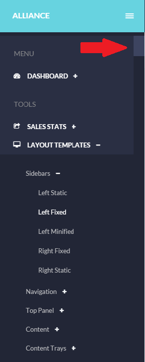
This section covers basic layout components: markup, classes and tags used in the theme for main skin elements.Sidebars
With the help of additional classes, you set the positioning and state (expanded/minified) of sidebars.
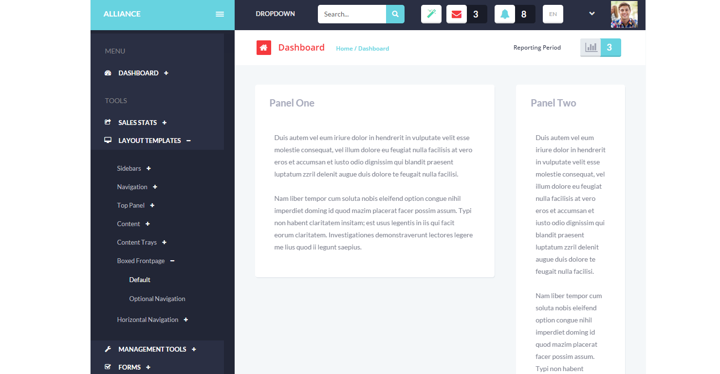
- Left static /sidebar-left-static.html/
Left static sidebar is created adding:
In order to have it expanded (default state) .sb-l-o class is added to the body tag:
- Left fixed /sidebar-left-fixed.html/
- Left minified /sidebar-left-minified.html/ : this state of left sidebar is created with .sb-l-m class added to the body tag. The submenu items are seen on hover.
- Right fixed/sidebar-right-fixed.html/
- Right static /sidebar-right-menu.html/
In case you need a fixed positioning for the sidebar, class .affix is added:
With fixed sidebar, you will see a scrollbar if the list of content is longer than the screen height:
In order to have the sidebar hidden by default, use .sb-l-c added to the body tag.
The menu is expanded clicking icon  .
.
In case you need a fixed positioning for the right sidebar, class="affix" is added:
You will see the sidebar even when scrolling the page, its position is fixed on the page:
Right static sidebar is created adding
Navigation
Navigation bar is created using .navbar class. It can be
- Static /navigation-static.html/ - not seen when scrolling the page:
- Fixed /navigation-fixed.html/ - its position is fixed at the top when scrolling.
The example you can see below:
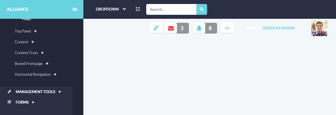
Topbar
-
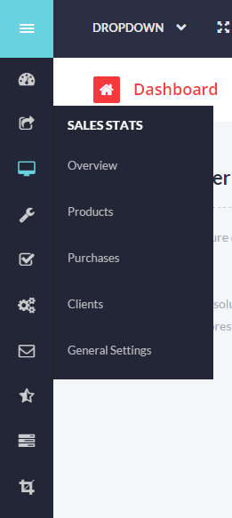
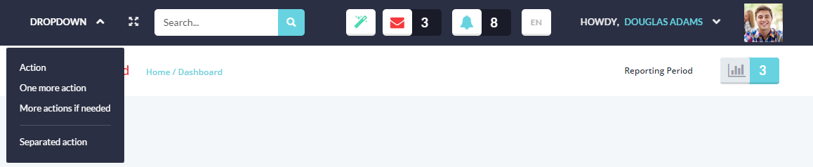
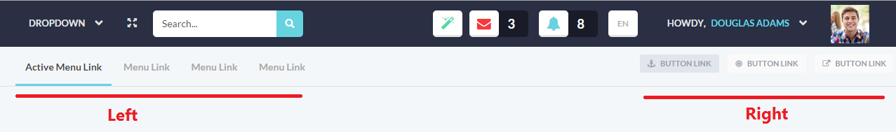
Default top navigation bar /top-panel.html/ includes the following elements with working jQuery:
- Dropdown menu
- Search field which requires additional scripts if you want to have it working.
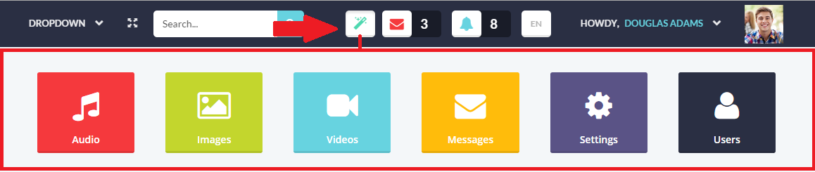
- Icon to expand additional dropmenu panel:
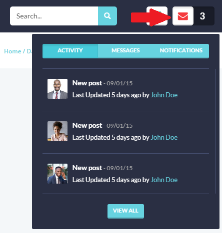
- Icon to expand the panel with last activities/messages/notifications:
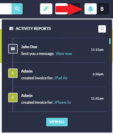
- Icon to expand a scrollable activity reports panel:
- Language selector
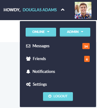
- User login panel
With menu /top-panel-menu.html/: this top navigation bar includes left and right menu bars, in addition:
Content Body
- Blank /content-blank.html/: the title goes under the header when scrolling. .blank-page is added to the body tag.
- Fixed /content-fixed.html/: the content chute is scrolled on the page, while the header and left sidebar stay fixed.
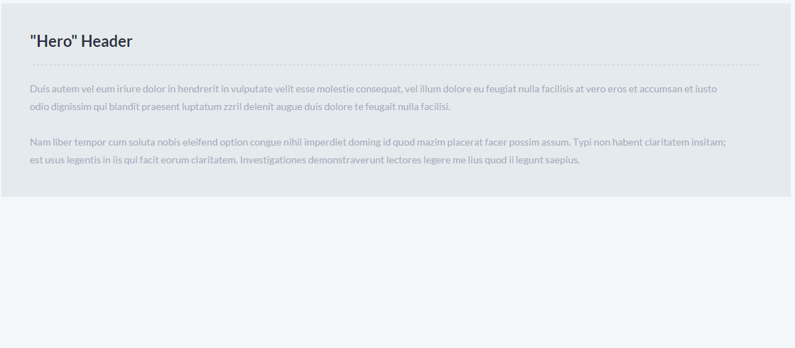
- Hero Content /content-hero.html/: page heading has a another style. Its content is wrapped in .page-heading.
Content Chutes
Using .chute, several content blocks of different positioning and state can be created on the page:
- Left Static /chute-left.html/
- Left Fixed /chute-left-fixed.html/: In order to have the chute fixed on the page, when the page is scrolled, you should wrap its content in .scroller-bar:
- Right Static /chute-right.html/
- Right Fixed /chute-right-fixed.html/
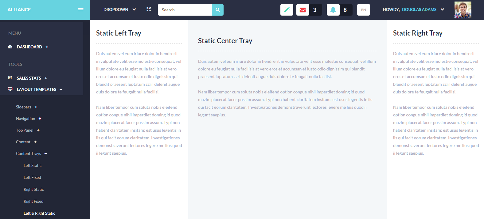
- Left and Right Static /chute-both.html/: In this case three chutes are added to the page: left, center, and right.
- Left and Right Fixed /chute-both-fixed.html/. This page layout is created using the above-mentioned classes, in addition .scroller-bar is added to fixed chutes.
Boxed Frontpage
- Default /boxed-default.html/: the layout with boxed body style, the background color is seen on its both sides. It is set using .boxed-layout added to the body tag:
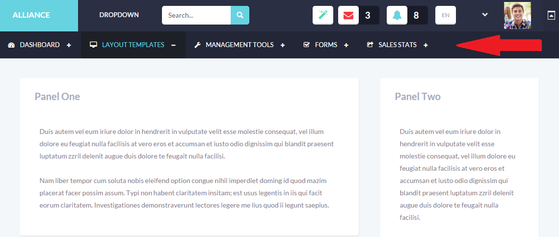
- Optional Navigation /horizontal-navigation-boxed.html/: this layout template has top horizontal navigation created with .sb-top added to the body tag:
Horizontal Navigation
As mentioned above, .sb-top added to body tag creates horizontal navigation bar. Depending on the class you utilize, you can have it Medium (default state, does not require additional markup), Small (.sb-top-sm) and Large (.sb-top-lg).


Management tools
The theme includes multiple tools which can be used for your project web app allowing you to change a panel title, position, view, etc. You can edit, sort, filter, remove panels - and all these changes are saved via local storage after refreshing.Panels
Please check management-tools-panels.html file to see the examples of panel types. By default, .panel is used to create different types of content blocks with border and padding for user interface:
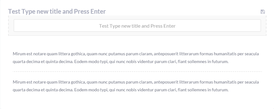
- Editable title : this kind of panel has edit/save options allowing the user to edit the title and save it.
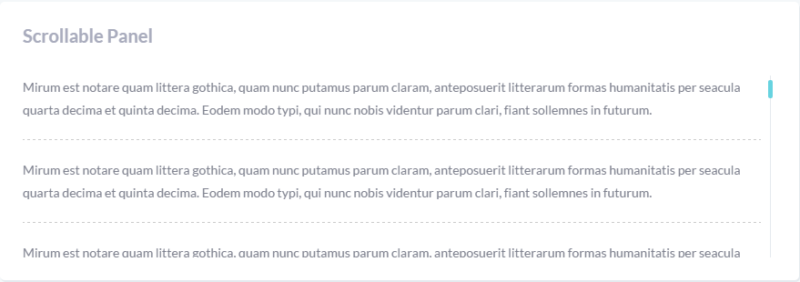
- Scrollable panel : the panel with a scrollbar of fixed height.
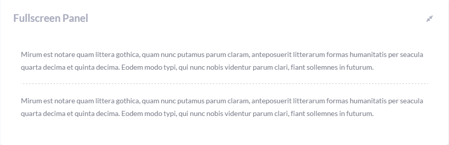
- Fullscreen panel :the user can expand the panel to the fullscreen mode.
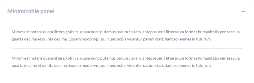
- Minimizable panel can be minimixed and opened again using panel controls.
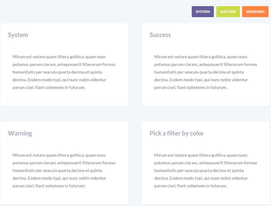
- Filter panel creates the block of elements tha can be filtered.
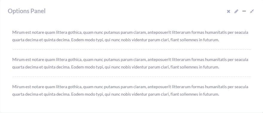
- Options panel : has a set of all controls mentioned in previous panel types: delete option (with popup message "Are you sure?"), edit, save, and fullscreen buttons.
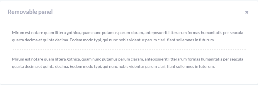
- Removable panel : the panel which can be removed from the website.
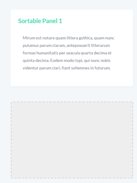
- Sortable panels : you can drag the panel to the needed position.
Modals
Each modal is wrapped in .holder-style. When the modal is selected, it automatically becomes .holder-active.
There are different Modal Content Types included in the theme. Icons from FontAwesome library are added with .fa:
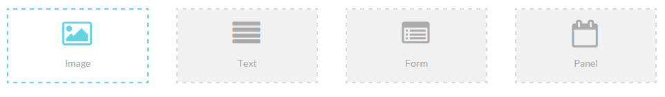
- Image: .fa-picture-o
- Text: .fa-align-justify
- Form: .fa-list-alt
- Panel: .fa-calendar-o
The page also illustrates what animation effects can be added to any element, it is achieved adding "data-effect" attribute to each button tag, for example:
The name of class name for each animation effect can be found in management-tools-panels.html file.
Dock
Management-tools-dock.html file shows that any type of content/media can be sent to AdminDock. Each item is wrapped in .holder-style and has a link to "dock-content" id:
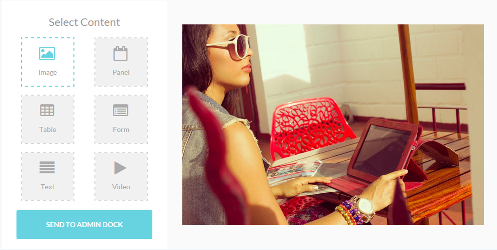
Dock-content HTML looks like this:
Forms
The theme allows you to create catchy forms very quickly using various classes and attributes depending on the look and functionality you need.
Inputs
Forms allow you to gather the needed information about website visitors. These are basic rules you should follow to create a user form:
- Text input is wrapped in label with utility class .field. Text-based input fields includes support for all HTML5 types: "text", "password", "datetime", "datetime-local", "date", "month", "time", "week", "number", "email", "url", "search", "tel", and "color".
- Disabled input field: you can add attribute "disabled" to have inactive fields and the corresponding style:
- Use Bootstrap predefined grid classes to align labels and groups of form controls in a horizontal layout by adding .form-horizontal to the form. Doing so changes .form-groups to behave as grid rows, so no need for .row.
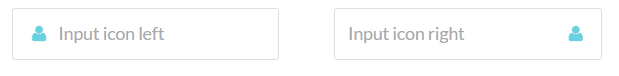
- Fields with icons are created using .prepend-icon for left icon alignment and .append-icon - for right icon alignment:
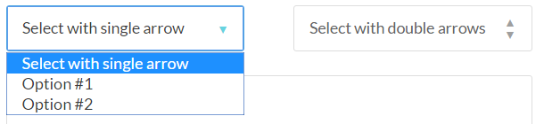
- Select menus are created using select, each item is wrapped in option, .arrow class allows to add the arrow to expand options :

Input tooltips
In order to add some explanation tips on what information should be entered in the field, input tooltips are used.
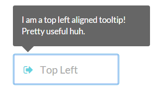
They are added as additional .tooltip inside the label:
The positioning of the tooltip box is set using a utility class added to .tooltip: .tip-left-top/.tip-left/.tip-right/.tip-right-top/.tip-right-bottom/.tip-left-bottom .
Validation states
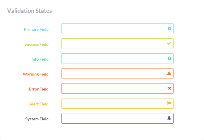
There are validation styles for such basic states as error, warning, and success on form controls. To use, add .has-warning, .has-error, or .has-success to the parent element. In addition, you can have .has-primary, .has-info, .has-system, .has-alert states styled correspondinly. Any .control-label, .form-control, and .help-block within that element will receive the validation styles.
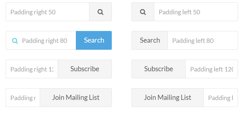
Input Addons
There are many other additional classes which allow you to style your input and submit fields:
- In order to have a field with a button, wrap your "label" inside .smart-widget. The positioning of the button is set with the left of .sm-right/.sm-right:
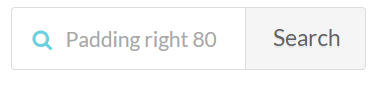
- The button width is specified using utility classes like .smr-80/.smr-50/.smr-120/.smr-140/.smr-160 (for right button alignemnt) and .smr-80/.smr-50/.smr-120/.smr-140/.smr-160 (for left button alignment).
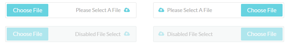
File uploaders
Feel free to add file uploaders with ready JQuiery and using the following markup:
Radios and Checkboxes
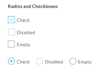
Each checkbox/radio is added using the following HTML, you should only change input type to "radio" to have it in radio style:
Attributes "checked" and "disabled" are used to have selected or disabled checkbox by default.
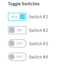
Toggle Switches
Toggles use almost the same markup as checkboxes, just specify lable class as "switch block". The switch has a rectangular shape by default, if you add utility class .switch-round, it will be rounded:
Reviews and Rating widget
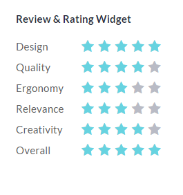
HTML for Rating block:
User forms
The theme utilizes multiple 3rd party plugins for user forms. Here is the list of some of them:
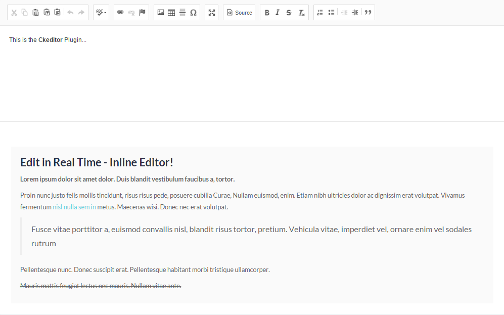
- CKEditor: documentation is at http://docs.cksource.com/
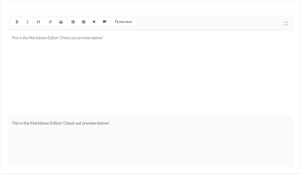
- Markdown editor. Please follow this link to check the plugin documentation http://markitup.jaysalvat.com/documentation/.
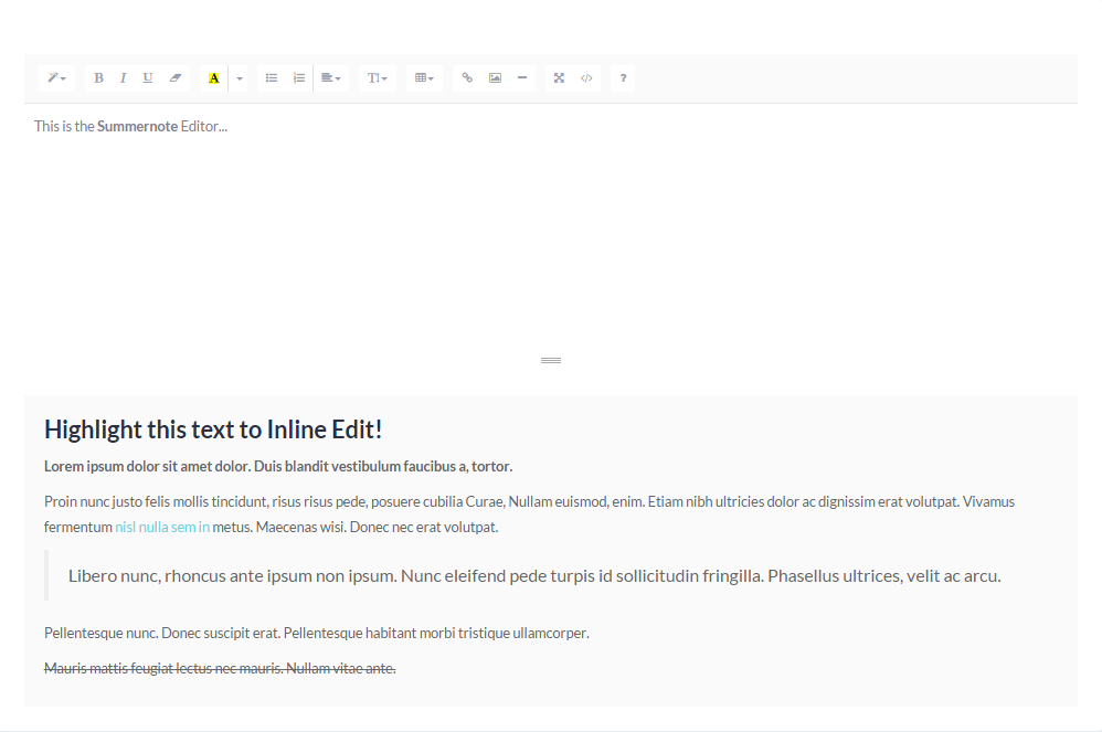
- Summernote editor documentation is at https://summernote.org/getting-started/
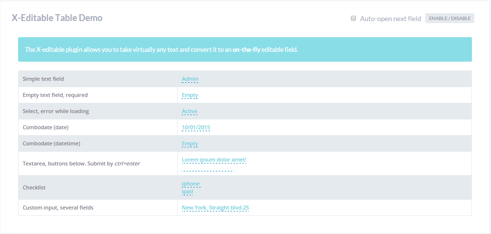
- XEditable editing. Please follow this link to check plugin documentation: http://vitalets.github.io/x-editable/docs.html.
AllCP forms
Feel free to use pre-designed allcp-forms for sales statistics:
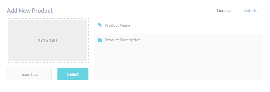
- Add new product
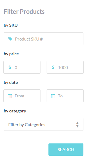
- Filter products
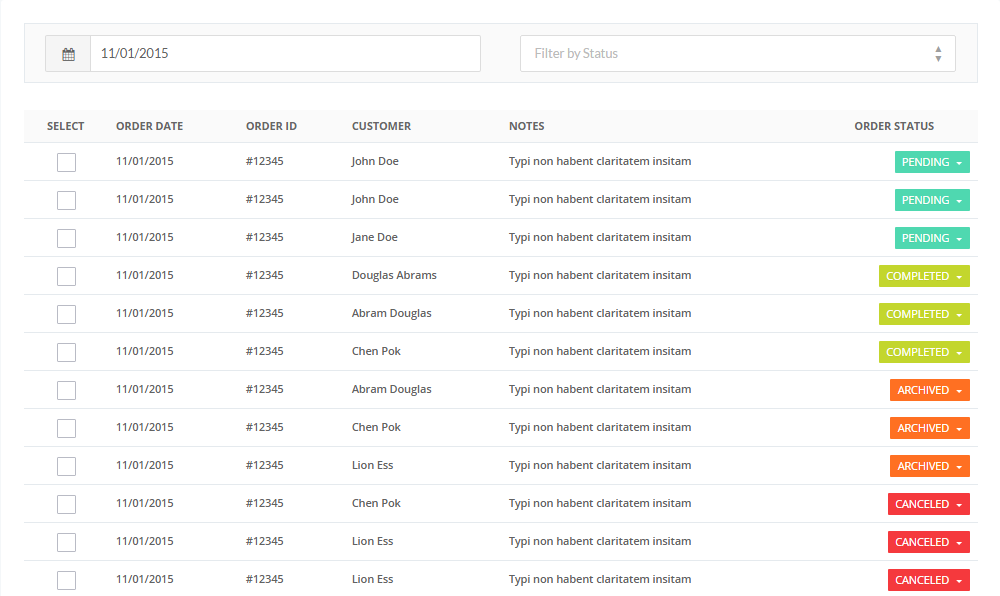
- Orders
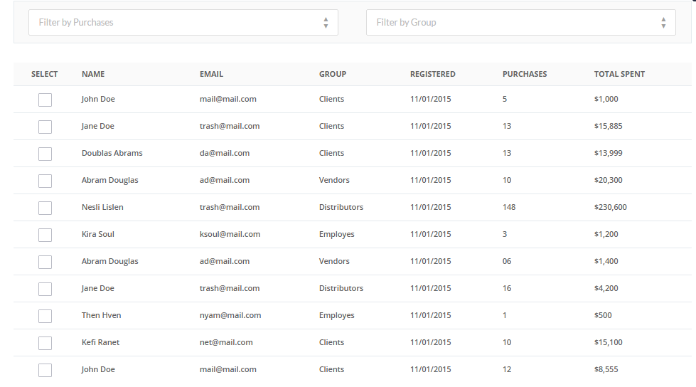
- Users
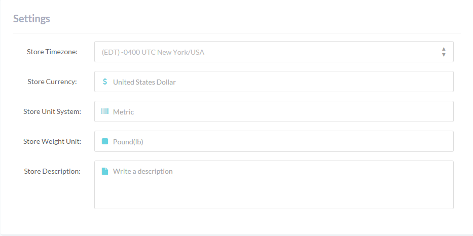
- Settings
Widgets
Scrollers and Tiles
Scrollers
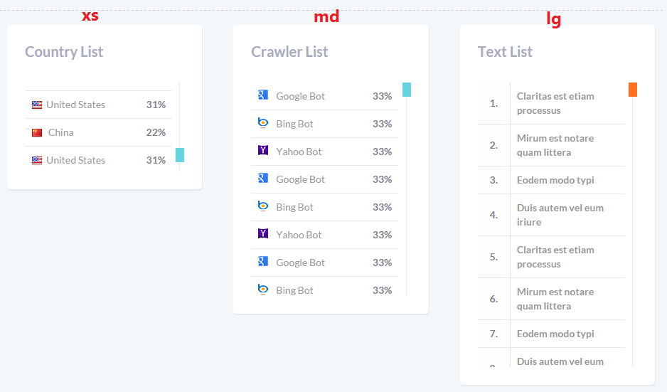
In order to use a scroller in the block, .panel-scroller is added to panel body.
Additional markup is added to specify the height and style of the scrollbar:
- .scroller-primary: blue scroller handle.
- .scroller-success: green scroller handle.
- .scroller-info: scroller handle of #4fd8b0 color.
- .scroller-warning: scroller handle of #ff7022 color (orange).
- .scroller-thick: to make the handle thick (thin is a default state).
- .scroller-xs height: 125px;
- .scroller-sm height: 200px;
- .scroller-md height: 300px;
- .scroller-lg height: 400px;
Color and style options:
On the example below thick scroller handle of orange color is displayed:
Height Options:
Tiles
Tiles are added to the panel using .panel-tile added to the .panel. The HTMl for the following tiles can be found on widgets-scrollers-tiles.html page:
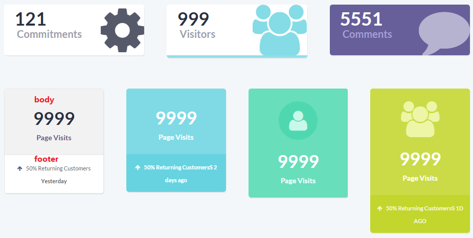
Each panel contains .panel-body and, if there is a need, .panel-footer:
Panels
There are different types of widget panels included. They are illustrated in widgets-panels.html file:- Calendar widget: just add #calendar-widget to the panel body:
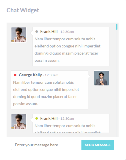
- Chat widget:
- Quick post widget:
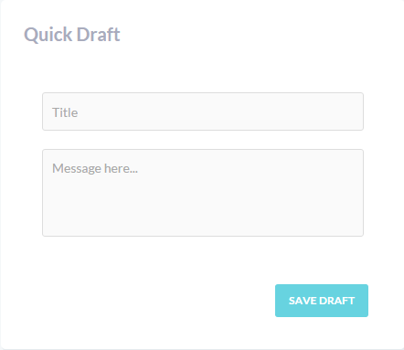
- Quick draft widget:
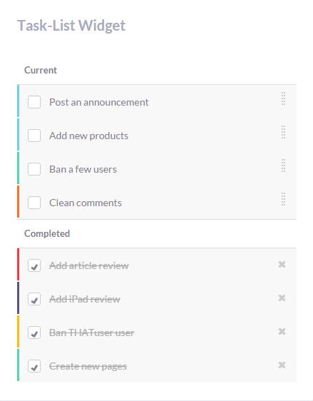
- Task list widget:
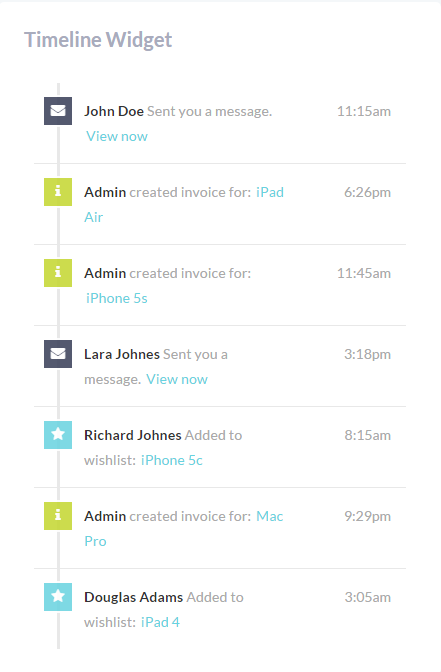
- Timeline widget:
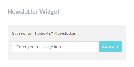
- Newsletter widget
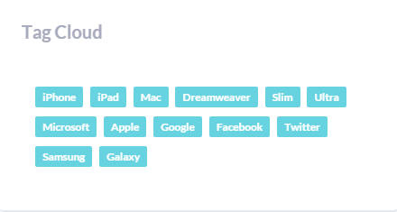
- Tag cloud widget: provides a ready design for tag clouds. The widget HTML can be found in widgets-panels.html file.
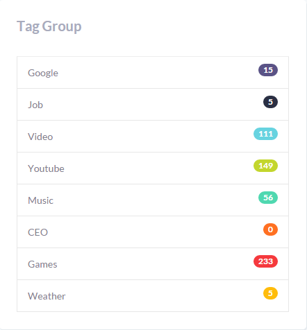
- Tag group widget: The widget HTML can be found in widgets-panels.html file.
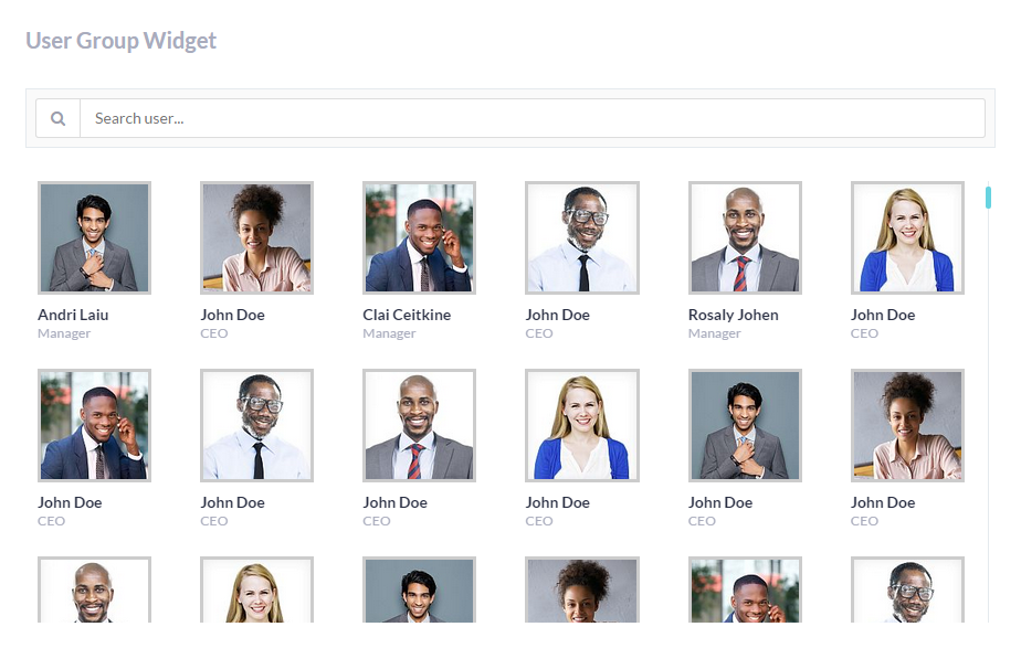
- User group widget:The widget HTML can be found in widgets-panels.html file.
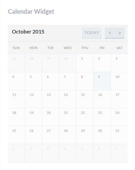
Fullcalendar plugin is used to create the widget. To get more information on the plugin, please check the following link: http://fullcalendar.io/docs/.
Each user avatar and message is wrapped in .media, the image is in .media-left, the message - in .media-body.
All the content of the widget is entered directly to widgets-panels.html file.
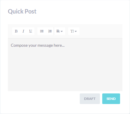
Class "summernote-quick" creates editor block in the panel body:
Summernote plugin is applied here, for more details please check its documentation file at http://summernote.org/jsduck/
Class "allcp-form" allows you to add the allcp-form easily.
.task-list is added to ul tag, list items are created with .task-item added to li tag.
JQuery Sortable is applied for the widget.
All the content of the widget is added/edited in HTML file.
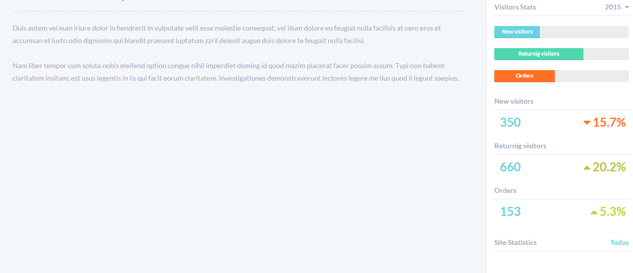
Tools
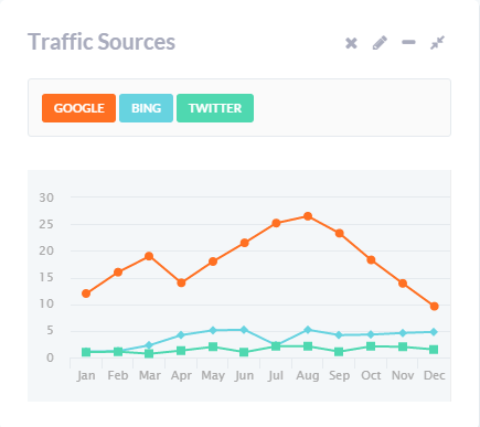
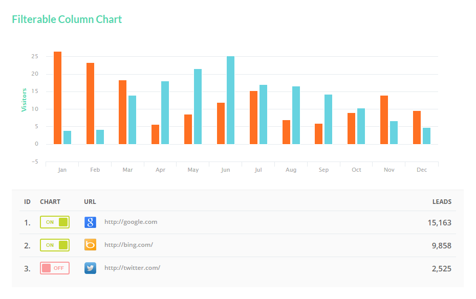
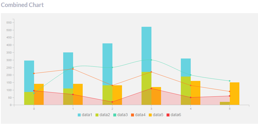
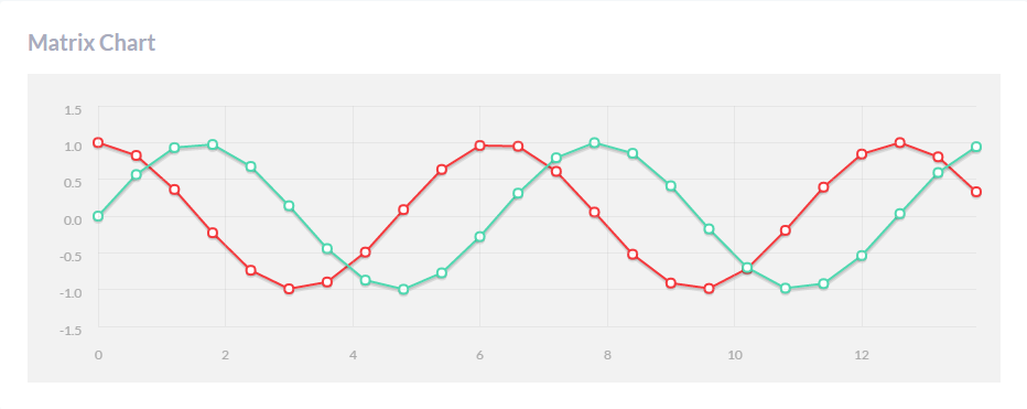
The page illustrates graphs and charts that can be built using the theme. 3rd party plugins are used here. The content is loaded both from html and js files.
- Traffic sources: Highcharts - High Line 3.
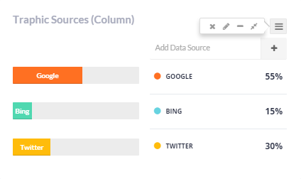
- Traffic sources (column): the graphs are added using progress bars.
- Server stats: Charts - C3 Charts: Guage Chart.
- Visitor geography: JVectorMap Plugin - Widget VectorMap.
- Visitor graph widget: Charts - C3 Charts: Area Chart.
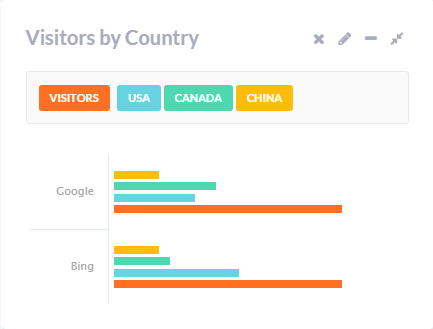
- Visitors by country: Highcharts - End high columns (high bars).
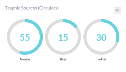
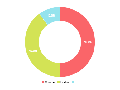
- Traffic sources (circular): Highcharts - Circle Graph.
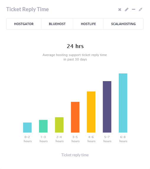
- Ticket reply time: Highcharts - Column Chart3.
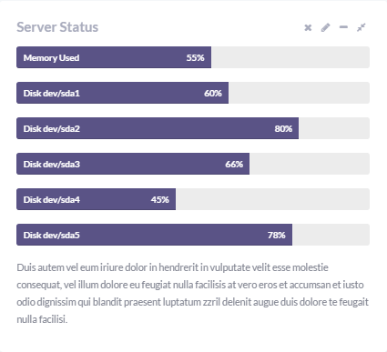
- Server status: the graphs are added using progress bars.
- Poll: Charts - C3 Charts: Donut Chart.
The content of the High chart is located in assets/js/demo/charts/highcharts.js file. For more details, please check plugin documentation at http://api.highcharts.com/highcharts.
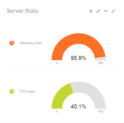
The content of the Guage Chart is located in assets/js/demo/charts/d3.js file. Th plugin documentation can be found at http://c3js.org/reference.html.
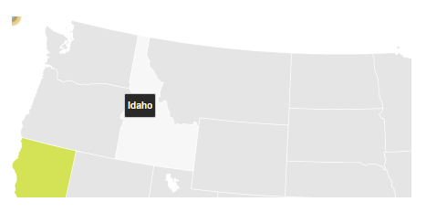
For more details please check plugin documentation at http://jvectormap.com/documentation/.
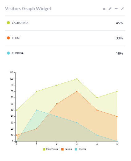
The content of the Area Chart is located in assets/js/demo/charts/d3.js file. Th plugin documentation can be found at http://c3js.org/reference.html.
The content of the chart is located in assets/js/demo/charts/highcharts.js file. For more details, please check plugin documentation at http://api.highcharts.com/highcharts.
The graph content is in assets/js/demo/charts/highcharts.js file. For more details, please check plugin documentation at http://api.highcharts.com/highcharts.
The content of the High chart is located in assets/js/demo/charts/highcharts.js file. For more details, please check plugin documentation at http://api.highcharts.com/highcharts.
The content of the Donut Chart is located in assets/js/demo/charts/d3.js file. Th plugin documentation can be found at http://c3js.org/reference.html.
Email layouts
The theme offers several catchy layouts for your emails messages.
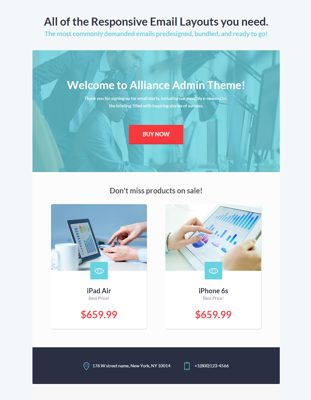
- Welcome template
- Upsell template
- Ping template
- Invoice template
- Shipped template
- Invite template
- Progress template
- Survey template
- We miss you template
The HTML files for each template are located in assets/templates/email folder.
User interface
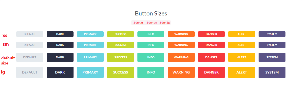
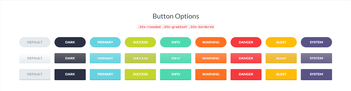
This section discloses the information on how to easily choose the design for such elements as alerts, buttons, icons, page layout (grid), text, progress bars, panels, etc.
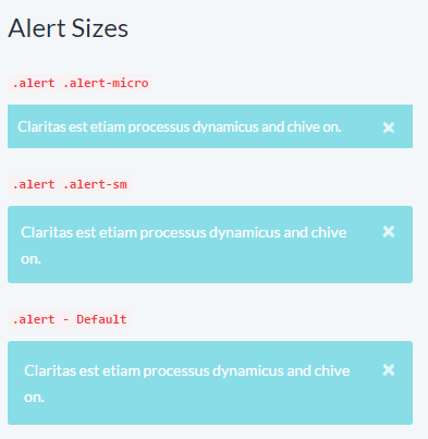
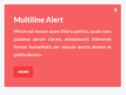
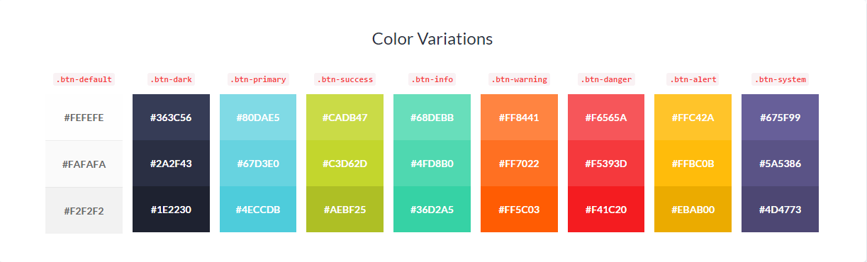
Any text can be wrapped in .alert - it will create a default grey alert. In order to change its style, you should use additional contextual classes. On the images below you can see what classes are used to choose the design for your alert messages.
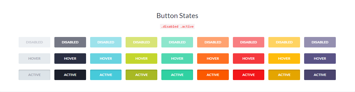
On the image below the whole block with h3, text and button is wrapped in .alert: You can use button classes on a, button, input elements. We recommend using button for navigation and to ensure matching cross-browser rendering. .btn-block is added as the utility class to span the full width of a parent.
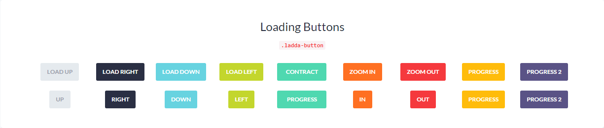
In order to have loading buttons, utility class .ladda-button is added. The direction of loading is specified with the help of attribute "data-style": Here is the example HTML for loading button: In order to see these buttons in action, please check user-interface-buttons.html file and locate the following block:
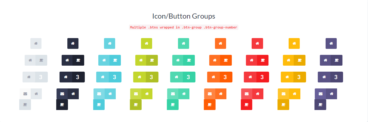
Several buttons can be wrapped in .btn-group. Please check the HTML for button group below:
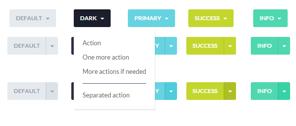
Dropdown buttons are created using utility class .dropdown-toggle with additional attribute data-toggle="dropdown". Please check the HTML for dopdown menu button:
This section covers basic markup used to create styled text.
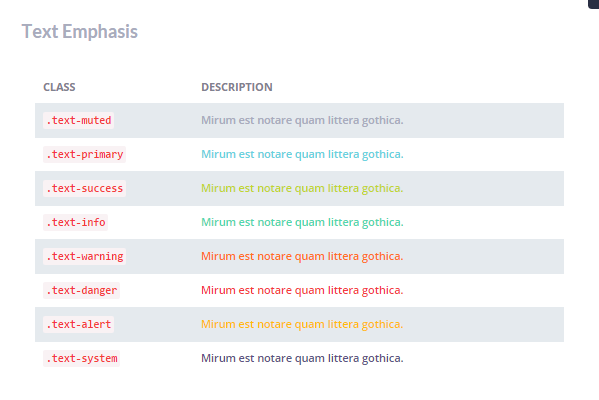
The image below illustrates what contextual classes are used to have colored text: Example HTML:
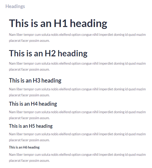
The usual h1, h2, h3, h4, h5, h6 are used for headings:
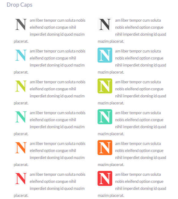
In order to add styles capital letters, use .dropcap. The font-color is applied with .dropcap-default/.dropcap-alert/ .dropcap-info etc. Class "dropcap-fill" is used to have colored background for capitals. Please check the HTML for filled dropcaps:
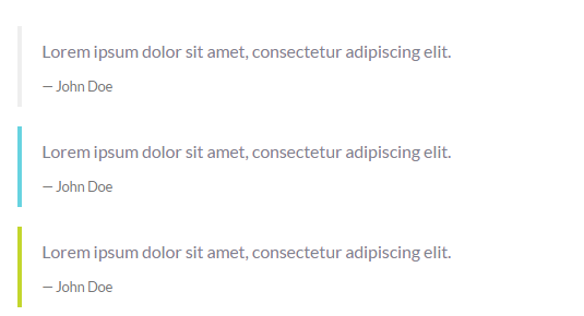
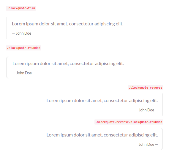
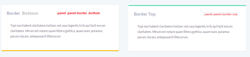
Quotations are wrapped in blockquote, they are grey by default. In order to change color, utility class is added: You can also alter the position of the border line and its width using the following classes:
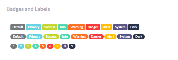
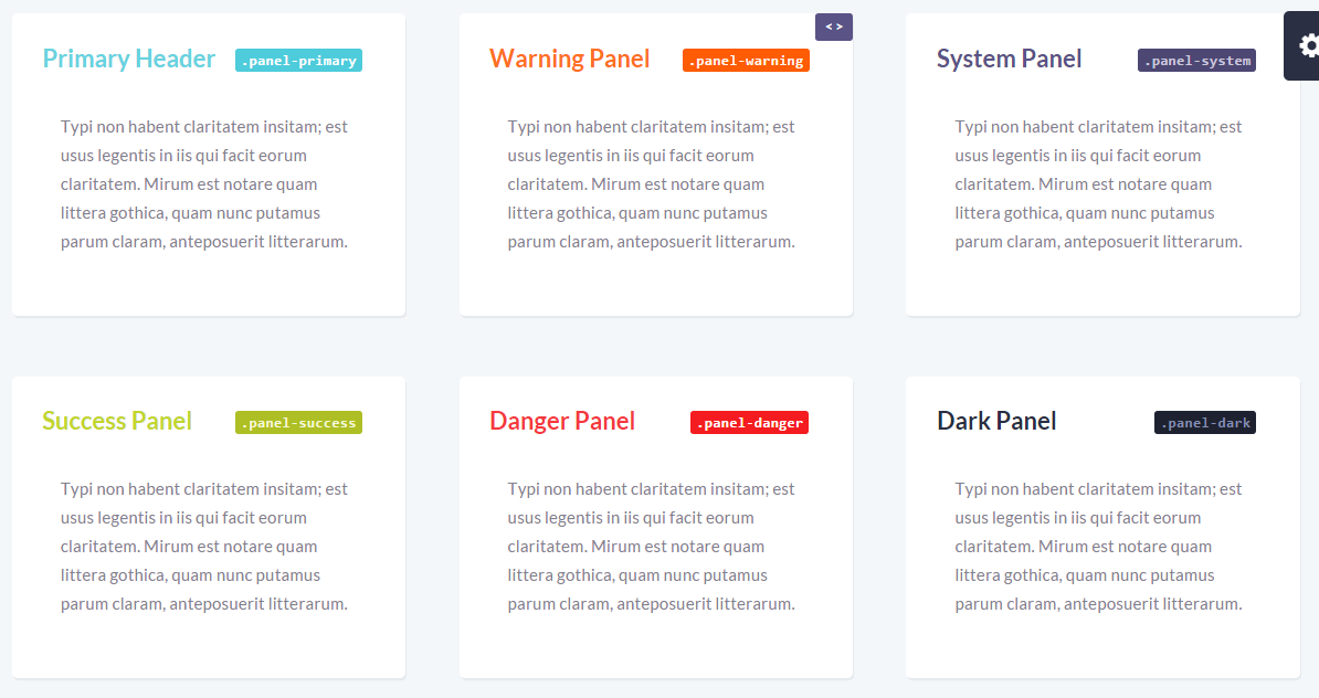
Badges are added using .label. Utility classes as .label-primary specify the background color, .label-rounded - rounded shape for the label: .panel applies some basic border and padding to contain the content. Basic panel with heading and content has the following structure:
Please Note!
HTML for basic progress bar:
As you can see, the bar size is set using .progress-bar-xxs/.progress-bar-xs/.progress-bar-sm/.progress-bar-lg/.progress-bar-xl/:
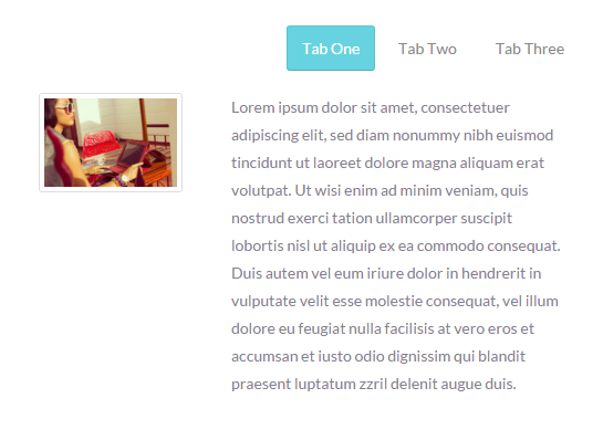
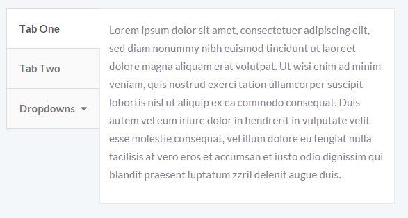
Tabs are created like li items wrapped in .nav. Each tab has an anchor link to the tab content id. Like in the following example:
.pull-right/.pull-left are used for tab alignment.
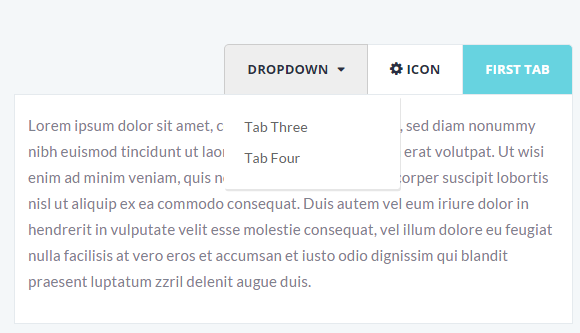
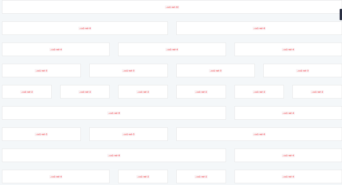
You can have dropdown menu and icons in the navigation tabs: Vertical tabs on the right or on the left are created using .tabs-right and .tabs-left added to ul: Page user-interface-icons.html contains the list of icons used in the theme. Bootstrap includes responsive grid system, which scales up to 12 columns. Grid system allows you to create a nice page layout using a series of rows and columns. Page user-interface-grid.html illustrates how to create columns and what class names are used for them: Page user-interface-progress-loader.html shows what page loaders can be applied in the theme.Alerts

Buttons
Typography
Panels
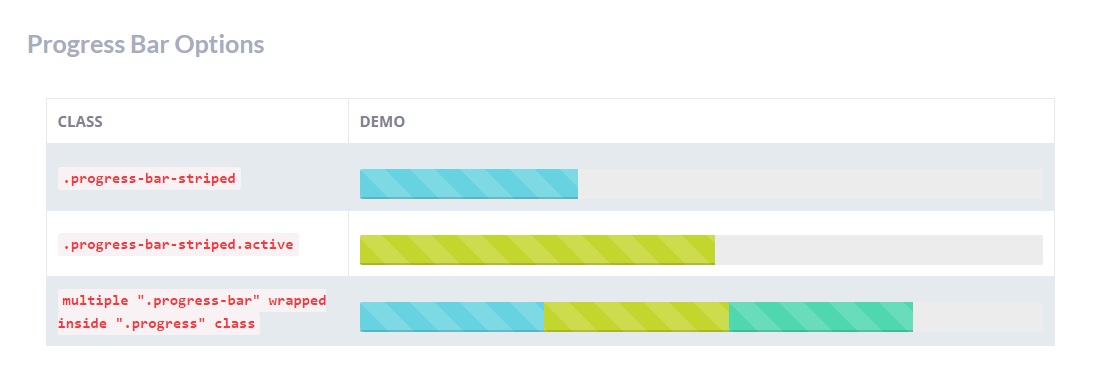
Progress bars
Progress bars use CSS3 transitions and animations which are not supported in Internet Explorer 9 and below or older versions of Firefox. Opera 12 does not support animations.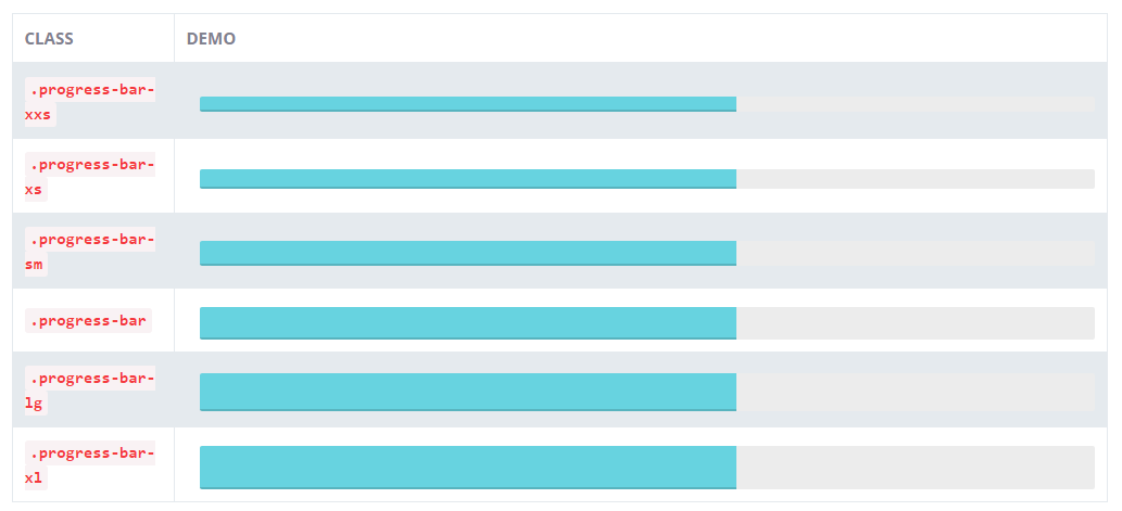
Tabs
Icons
Grid
Page progress loader
Plugins
There are 3rd party plugins used in the theme. Their source files are located in assets/js/plugins folder.
Maps
This section covers map plugins included in the theme:
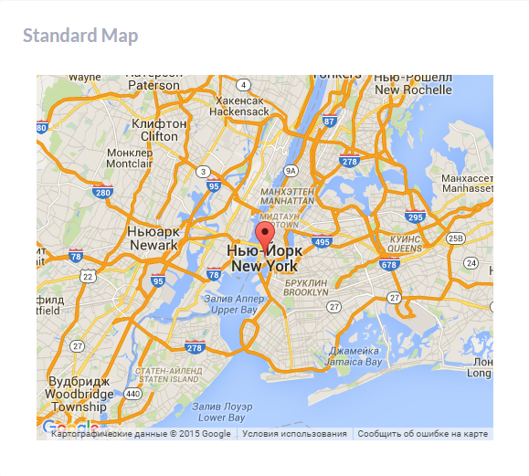
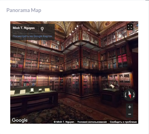
GMaps
Gmap plugin documentation can be found at the following link: http://hpneo.github.io/gmaps/documentation.html
Maps-basic.html file shows the types of maps that can be created using this plugin. Assets/js/pages/basic-maps.js file contains jQuiery:
- Standard Map
- Panorama Map
- Map with clickable locations
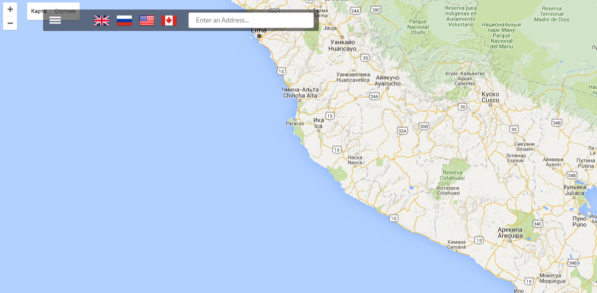
- Map with search
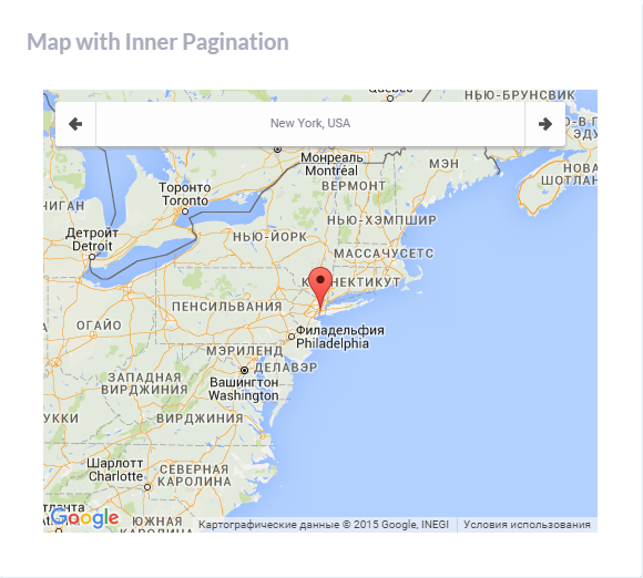
- Map with inner pagination
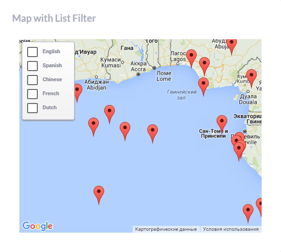
- Map with list filter
- Full map
Vector Maps
JVectorMap Plugin is used in the theme to create vector maps.
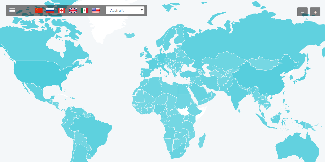
Plugin js file is located in assets/js/plugins/gvectormap/jquery.jvectormap.min. For more details, please check plugin documentation at http://jvectormap.com/documentation/.
Charts
- Highcharts plugin. Charts-highcharts.html file illustrates what chart types can be created using the plugin. For more details, please check plugin documentation at http://api.highcharts.com/highcharts.
- C3-D3 Charts. The plugin documentation can be found at http://c3js.org/reference.html.
- Flot. In order to get plugin documentation, please follow the link https://github.com/flot/flot/blob/master/API.md
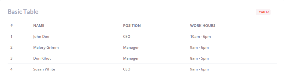
Tables
- Basic tables are created in the theme using .table. Additional utility classes can be found in tables-basic.html file:
- DataTables plugin documentation: http://datatables.net/reference/index.
- Sortable tables are created with class="table footable":
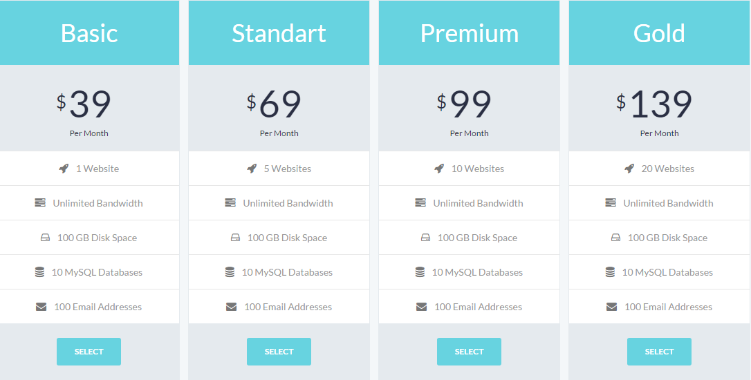
- Pricing tables: each table column is wrapped in .pricing-plan:
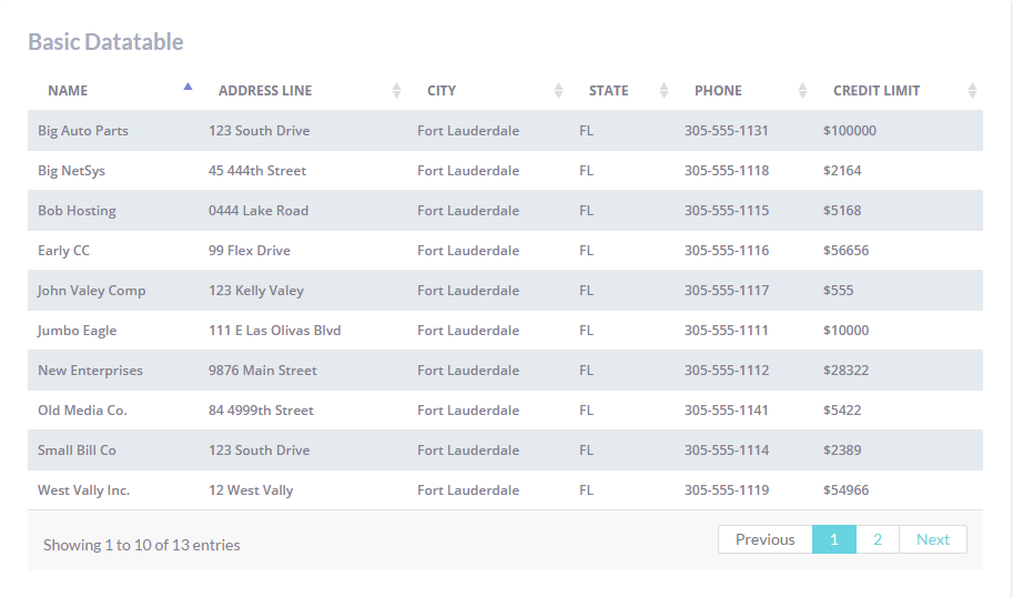
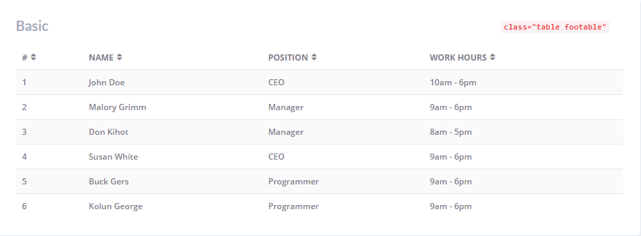
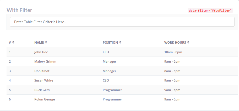
Table filter is added using attribute data-filter="#fooFilter":
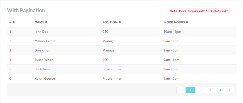
Pagination is applied with the help of attribute data-page-navigation=".pagination".
Pages
Here is the list of available pre-designed pages included in the theme:
- Account confirmation page: utility-confirmation.html
- Login page: utility-login.html
- Registration page: login-register.html
- Password reset page: utility-forgot-password.html
- Coming Soon page: utility-coming-soon.html
- 404 Error page: utility-404-error.html
- Search results page: basic-search-results.html
- User profile page: basic-profile.html
- Timeline page: basic-timeline.html
- Faq page: basic-faq-page.html
- Calendar page: basic-calendar.html
- Messages page: basic-messages.html
- Gallery page: basic-gallery.html
- Invoice: basic-invoice.html
Sources and Credits
This section discloses the sources of various files used within the theme and describes their function. Use this section to gain an understanding on how the theme functions behind the scenes, if considering any type of modification.
- Fonts:
- "Lato", "Open Sans".
- Fontello (non standard, icons set).
- 3rd party plugins. The list is available in assets/js/plugins folder.
All non-standard fonts are from Google Web Fonts and Fontello icons set.
We have used pictures from:
http://www.bigstockphoto.com/
All images are copyrighted to their respective owners and not available for download with this theme.